The moment I discovered there were fonts that existed outside of what just comes on your computer was an almost spiritual moment for me. At some point when we are more comfortable with one another, I will share with you how I used Papyrus on my wedding invitations, because that was literally the only font I could find that had the right feeling. I may even share with you how I felt that fonts like Rage Italic were acceptable to use in nearly any circumstance. But I am not sure we are there yet… these stories took place before that fateful day when I first learned about installing fonts.
But not everyone knows how to install a font. In fact, it’s the number 2 issue we get asked about (we will get to number 1 (licensing) in another blog). It can be overwhelming when you first discover a huge catalog of fonts to try out and don’t know how to get them. Then you can’t quite figure out how to use them. If this is you, you are most certainly not alone. Two to three times a day, we are asked questions about installing fonts.
Honestly, finding the perfect font you would like to install is the harder part once you get the hang of things. If you haven’t reached that near spiritual moment and are still using default windows fonts, try out Fontspace and check out over 66 thousand fonts, great for personal use.
Step by Step For Installing Fonts
Place your downloaded font on the desktop.
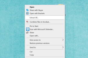
Most fonts will come in a zip file* (Image 1: looks like a file with a zipper on it), so you will want to right click on the zip file and choose the option that says “extract all” (Image 2).
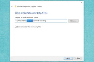
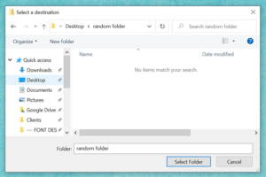
The next screen helps you select the destination to unzip the file. I recommend making sure that the desktop is the selected folder (Image 3). If it doesn’t say ‘Desktop’, it’s not a problem, you will just need to know the folder that it will be unzipped to. If you have a different folder selected and would like to have the font go to the desktop, just click the browse button (Image 4) and then select ‘Desktop’ under ‘This PC’.
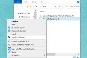
A new window will open up on your screen. Great job! You did it right. There might be one file or several depending on the font you downloaded. Next, you will need to right click on the font file you would like to install first and select ‘install for all users’ (Image 5).

Image 1: Zip File

Image 2: Extract All

Image 3: Select Destination for File

Image 4: Select Desktop

Image 5: Install for All Users
You’re finished. Nice work!!!
You may need to restart (close, then reopen) the program you are wanting to use the font in before it will show up in the options, and it’s also possible you will need to restart the computer before it will show up, but this is less likely.
A Few Notes
Having too many fonts can slow down your computer, so after you have two or three hundred you may want to look into a font manager.
Some people like to use our BMD-prefixed fonts, which are just versions with ‘BMD’ before the name of the font, so they are easy to find on your font list.
If you’re still having trouble, don’t worry. There are still many things to try, but we have never had a situation where we couldn’t get a font to work on someone’s computer. We will cover some of those scenarios in future blogs.
Video Tutorial
Follow our YouTube channel here.
I might be one of the worst at writing descriptions for fonts. For a long time I just didn’t do it, because that felt like actual work, and let’s be honest, I am not about that life. 😉 However, for the last few years Michael has been forcing me to think about it more and more, until now… I have radically matured and I just make him do it. I think part of the reason I hate it so much is that I don’t really think of fonts in a typical way, as simply a serif or a script. Fonts have feelings, after all. I don’t always create the same number of glyphs for each font. Sometimes I don’t even have a plan for what my font will look like when I start.
Sometimes I literally just turn on some music and start drawing letters that I think that music feels like. (Lots of Owl City went into the making of Submarine Beach.) Sometimes I listen to audio books and try to create something that would work for that setting. (I was listening to a book about a hedge witch while creating Hazel Grace.)
I think this (for me) is because I think of lettering more in terms of emotion. It’s less about the type of font I’m trying to create, and more about the feeling I’m trying to convey. I think this shows in an article I was interviewed for in 2014 about font names and how I choose them:
https://www.pastemagazine.com/design/once-upon-a-type-stories-behind-the-wildest-font-n/#6-orange-juice-by-brittney-murphy
For me, harnessing emotion is essential for good use of typography in design. That’s why when I actually do come up with write-ups for my work, they often include words that are not typically used in font descriptions, like “recklessly optimistic” (Little Miracles), “angsty” (Heartwrecked), or “wistful” (Beautiful Things). Wouldn’t it be great if we could search for fonts not just by their subcategory, but by their moods? (Casual and cantankerous, thank you very much.) (Also, awesome new search awesomeness coming soon…)
Failing to evoke the appropriate attitude and tone is a common mistake I often see in designs. Just because a client loves a font doesn’t guarantee it will mesh well with the identity they’re wanting to create. That said, yes, picking out a font you like is very important, but picking out one that you like and that communicates your message is more important. (And I’m very sorry, but no, Bleeding Cowboys is never going to effectively exemplify your corporate law office.)
Examples
Of course there are the over-the-top examples, such as the famous Fonts Matter image with ‘You’ll Always be Mine’ shown in both a romantic script and a scary scrawl. But that example might be too obvious to be of much use.
So I created another. Let’s say there’s a pizza parlour that might be opening soon. I came up with a name and a graphic that stay the same so we can focus squarely on the font. (Okay, okay, okay, so I may have lengthened or shortened the line a tad on each to better fit each font. I’m sorry! I couldn’t ignore my obsessive tendencies, but let it go, yeesh…)

So, the fonts. I used, in order of example, The Brooklyn Smooth Bold, Poundcake, and Hodgepodgery Outline. None of these are necessarily better or worse than the others. But they each promote an image of a different kind of pizza place. Is it classy? A place for kids? Or just your everyday casual kind of pizza place? Personally I like the Poundcake example (the middle one) the most, but if my brand is aimed at high end pizza, It might not be the right choice.
I see this often when someone is just learning to design. They know Papyrus and Times New Roman are out of the running, but are still just trying to use something new and different or something that stands out. But just because something is new, or screams ‘Look at Me!’, it isn’t necessarily better. Know your audience (or who you want your audience to be), and cater to them. So consider not only your client, but your client’s clients. If you know what I mean.
For example, when I’m working on something more upscale, I’m looking for symmetry and clean lines. Or, if, instead, my project needs a more accessible, down-to-earth feel, I often go with something hand-drawn, or at least slightly imperfect. If you’re not sure what type of font conveys the feel you’re looking for, do a little market research. Look at competitors with a good brand. What are they doing? Or branch out even more. Look at companies in entirely different markets that cater to the same type of audience you’re trying to reach. I’m not saying to find them and steal their fonts, but you can use these real world examples to find the type of fonts that might work well for you.
The Takeaway
So… my suggestion? When you start your project, don’t start with pictures, but with words. I didn’t do this for years and ended up having to go round after round with clients to get them what they wanted. Now I start with a questionnaire. My first one was 5 questions and now it has grown to almost 2 pages. Michael will even apologize for the length when we give it to a potential client. By far one of the most important sections is where we ask them to fill in what feelings they have when they think of their company. Time after time, this is how I see into their vision and separate it from my own ideas. Sometimes it helps to create a fictional person that you are aiming the project at. Let’s call him Jimmy. Jimmy is 8 years old, he likes school, video games, and thinks his older sister has cooties. So the question is… which pizza do you think Jimmy wants tonight? Let us know in the comments.
Need help creating a logo or picking a font having feelings for your next project? Let us know!
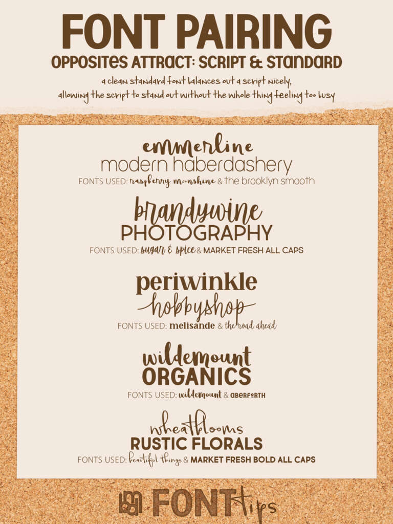
We wanted to offer up some answers for commonly asked questions we get about font pairing into a new series of font pairing guides. Our first tip? Pair script and standard fonts.

Script and Standard
Scripts are great! But they do tend to be ‘busy’. Try pairing one with another ‘busy’ font and they can battle with each other for attention, creating confusion and detracting from readability.
Simple standard fonts are also great! However, used by themselves in roles that should garner attention may make your project appear too formal or lacking in personality.
So an easy-to-remember tip: pair script and standard fonts together! Mixing these two together can help create a balanced look, keeping your work from feeling overcrowded, and making your title be the attention grabber. In fact, we often, in logo design, try to match the personality of the company/individual in a script font and use a standard font that conveys the level of professionalism of the industry they are in.
Please let us know what you think and what other future guides you would be interested in. 😀
Fonts Used in this Font Pairing Guide.
1. Raspberry Moonshine and The Brooklyn Smooth
2. Sugar and Spice & Market Fresh All Caps
3. Melisande and The Road Ahead
4. Wildemount and Aberforth
5. Beautiful Things and Market Fresh Bold
Check out other font Pairing Guides on our website here and on Pinterest.


